

YEAR: MMXXV
PROJECT TYPE: COMMISSIONED
DISCIPLINE: BRAND IDENTITY DESIGN
YEAR: MMXXV
PROJECT TYPE: COMMISSIONED
CATEGORY: BRAND IDENTITY DESIGN
YEAR: MMXXV
PROJECT TYPE: COMMISSIONED
DISCIPLINE: BRAND IDENTITY DESIGN
YEAR: MMXXV
PROJECT TYPE: COMMISSIONED
CATEGORY: BRAND IDENTITY DESIGN
NEUPHORIA
NEUPHORIA
NEUPHORIA
NEUPHORIA
NEUPHORIA
BRIEF OVERVIEW
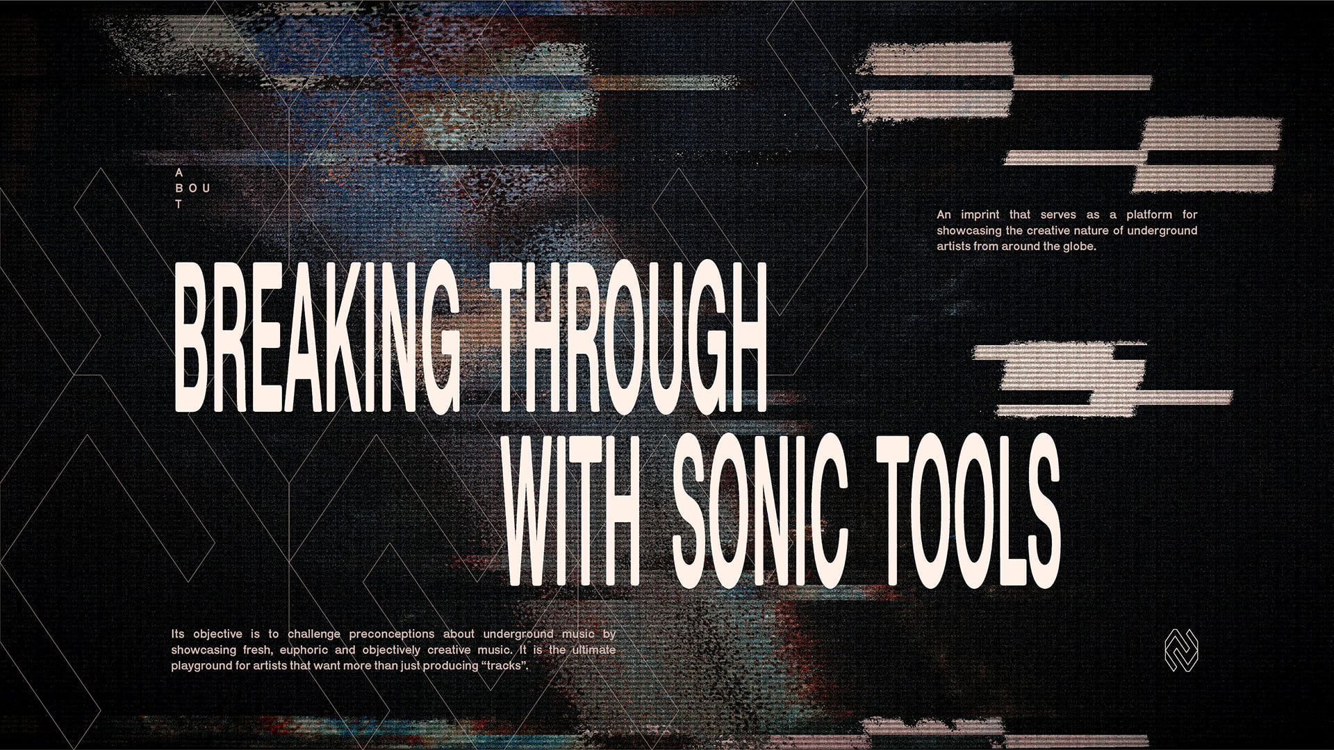
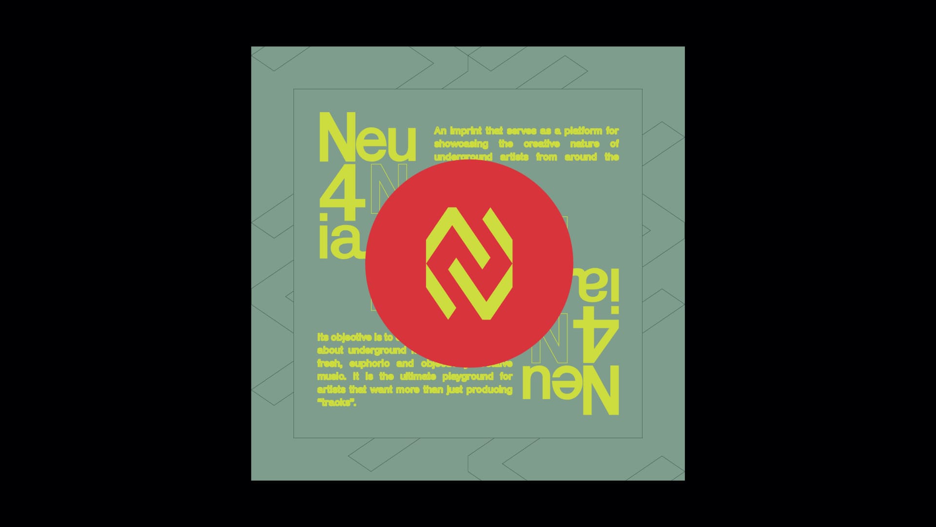
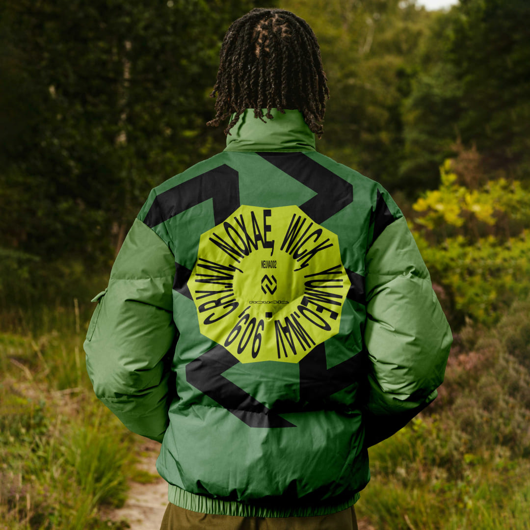
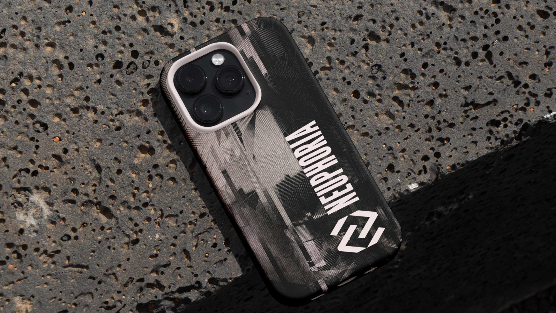
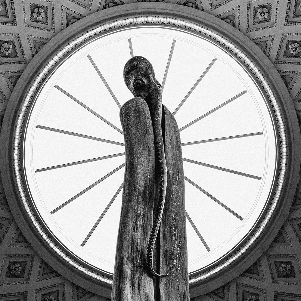
Neuphoria emerges as an imprint rooted in the underground, an evolving platform built to amplify experimental techno and the voices shaping it. Based in Prague, and curated by crydotnn and wav909, the label positions itself within a global network of artists and listeners who thrive on sonic exploration. The brief called for an identity that could hold this raw, exploratory spirit while remaining precise and adaptable across formats. At its core, the brand needed to feel open yet intentional, resonating with a community that values discovery, collaboration, and the culture surrounding underground music. The challenge was to create a visual system that doesn’t just represent sound, but behaves like its fluid, immersive, and constantly evolving.
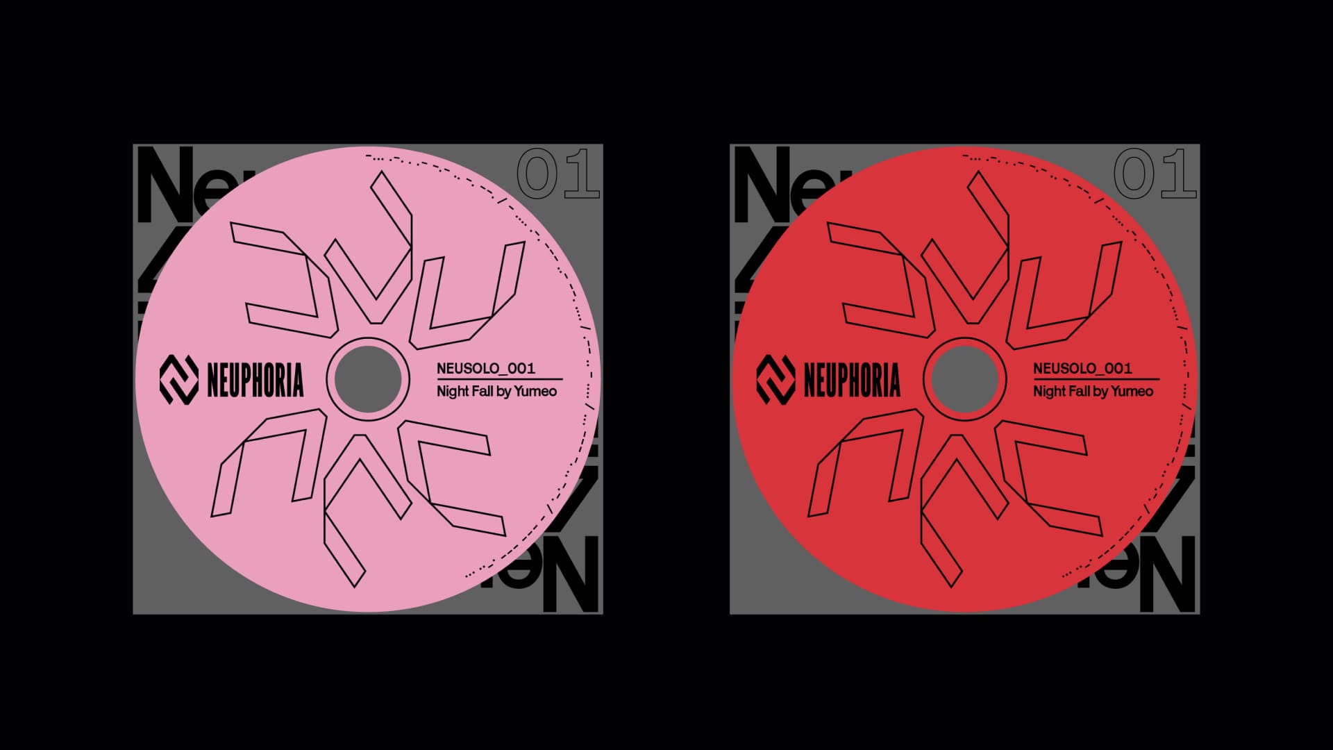
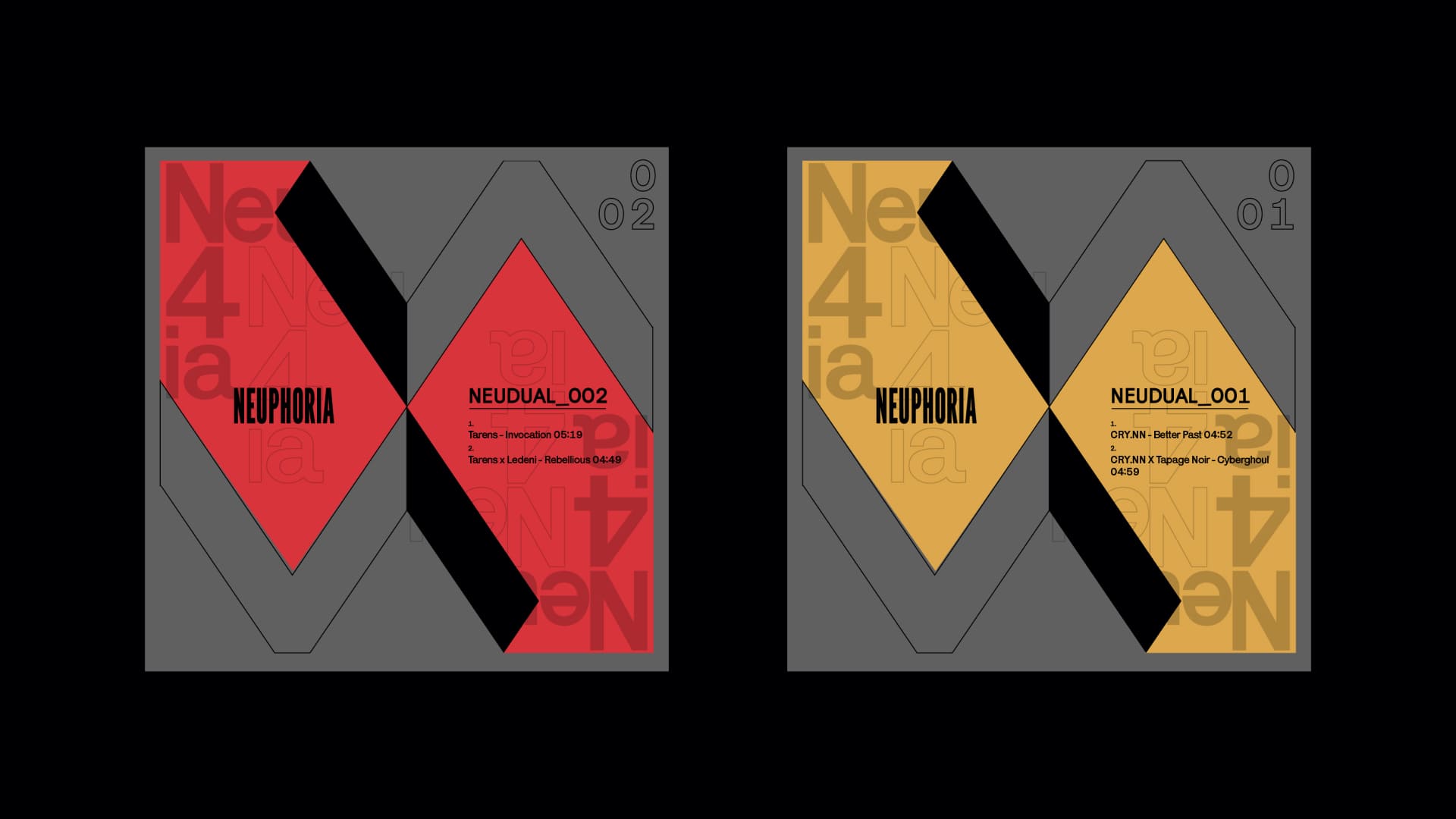
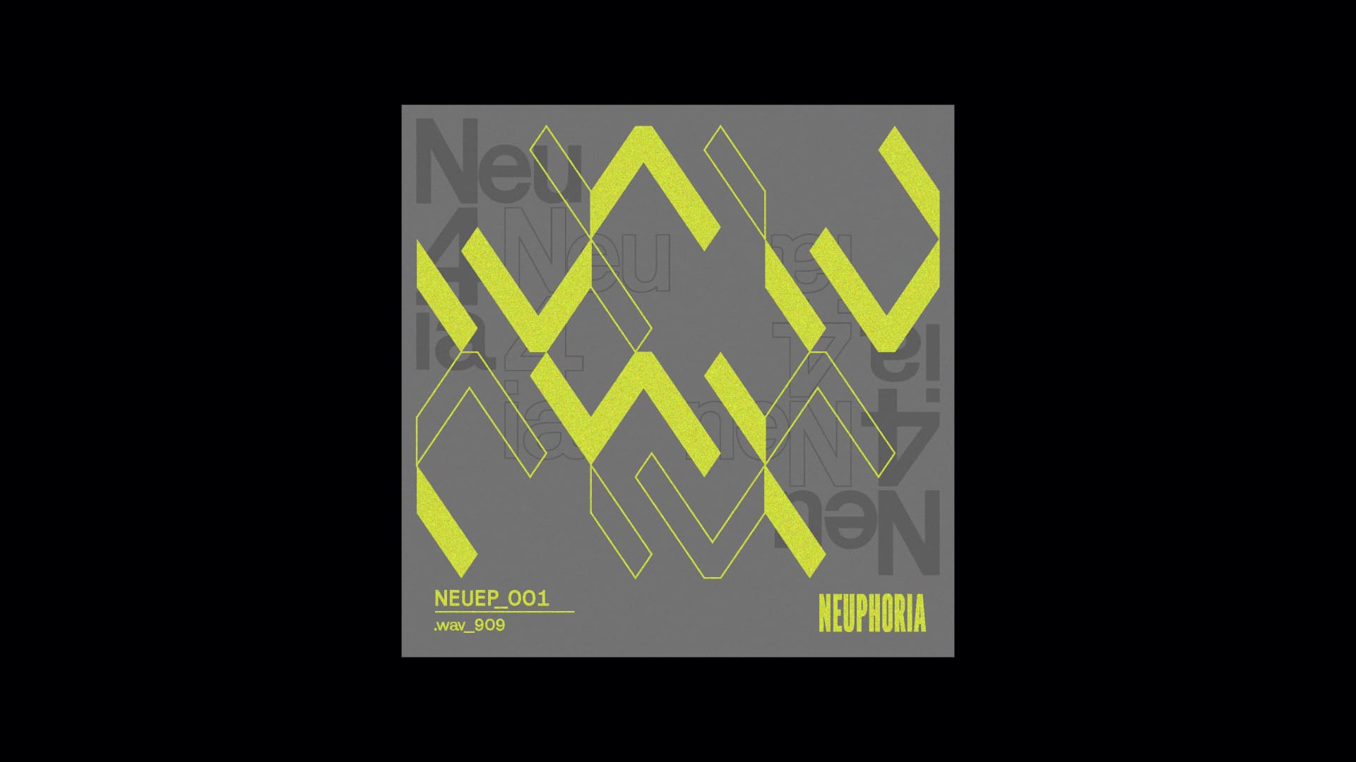
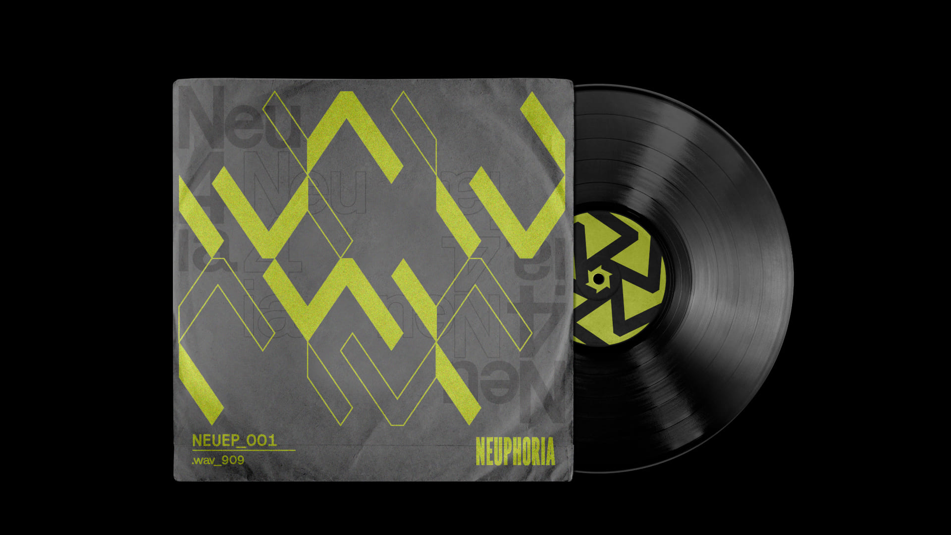
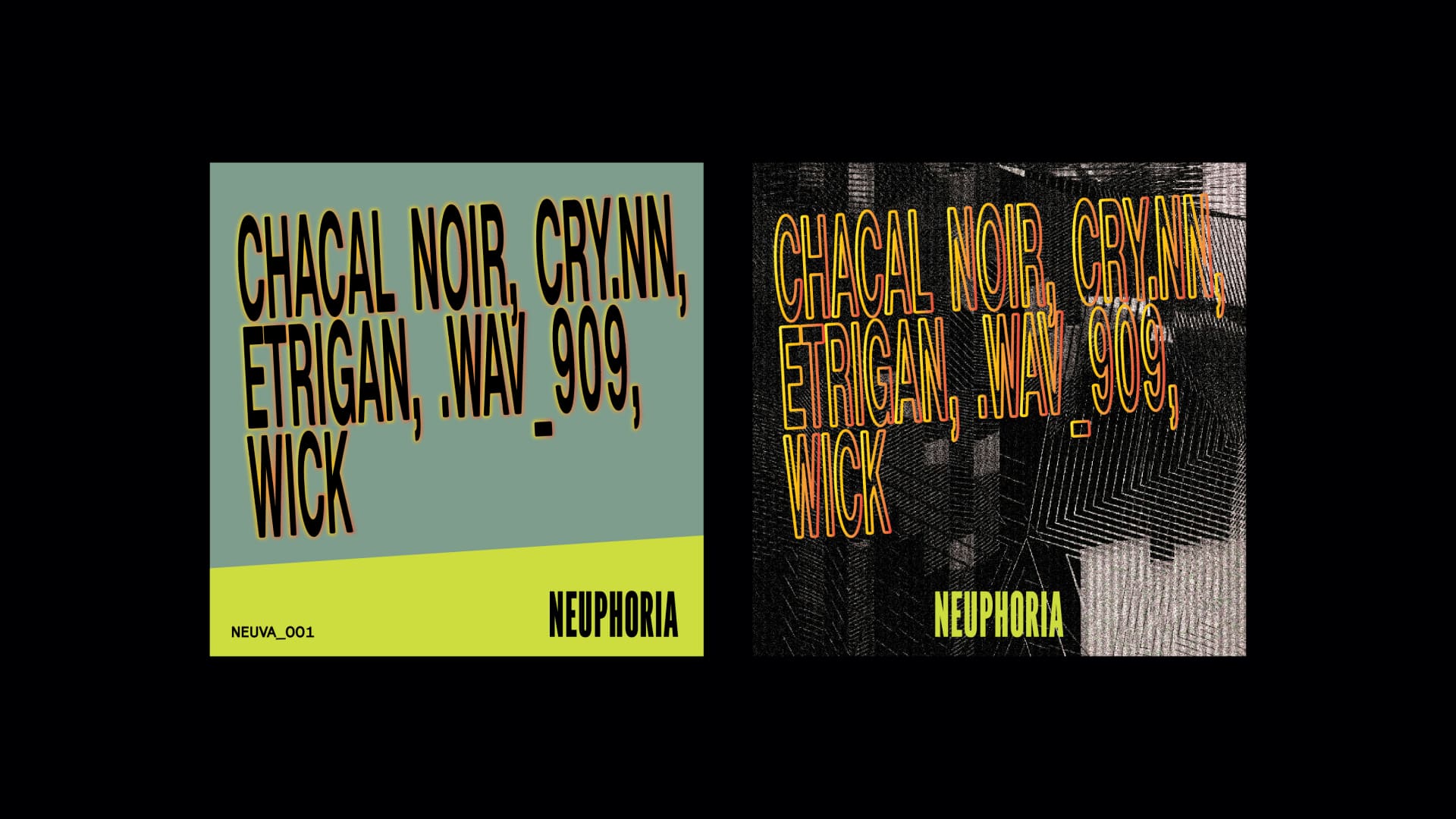
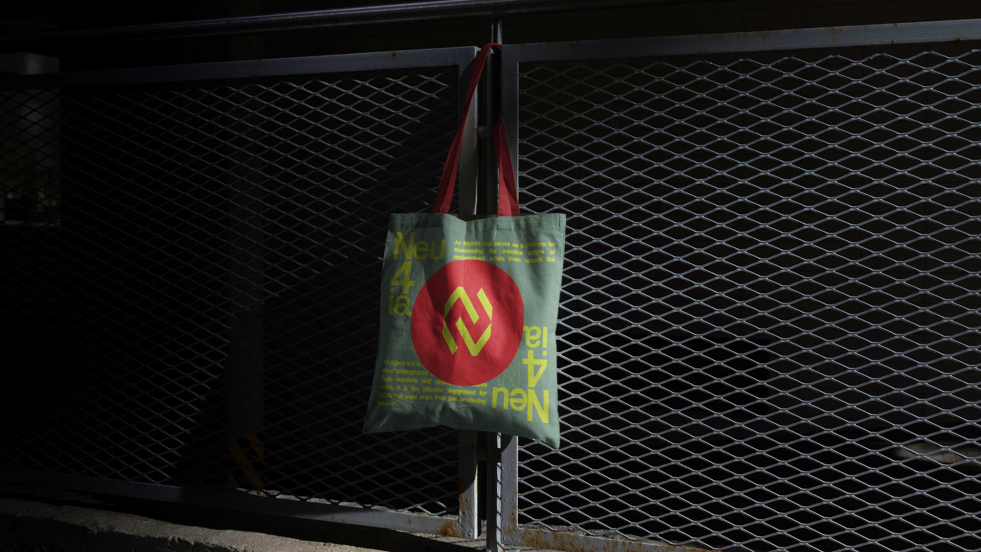
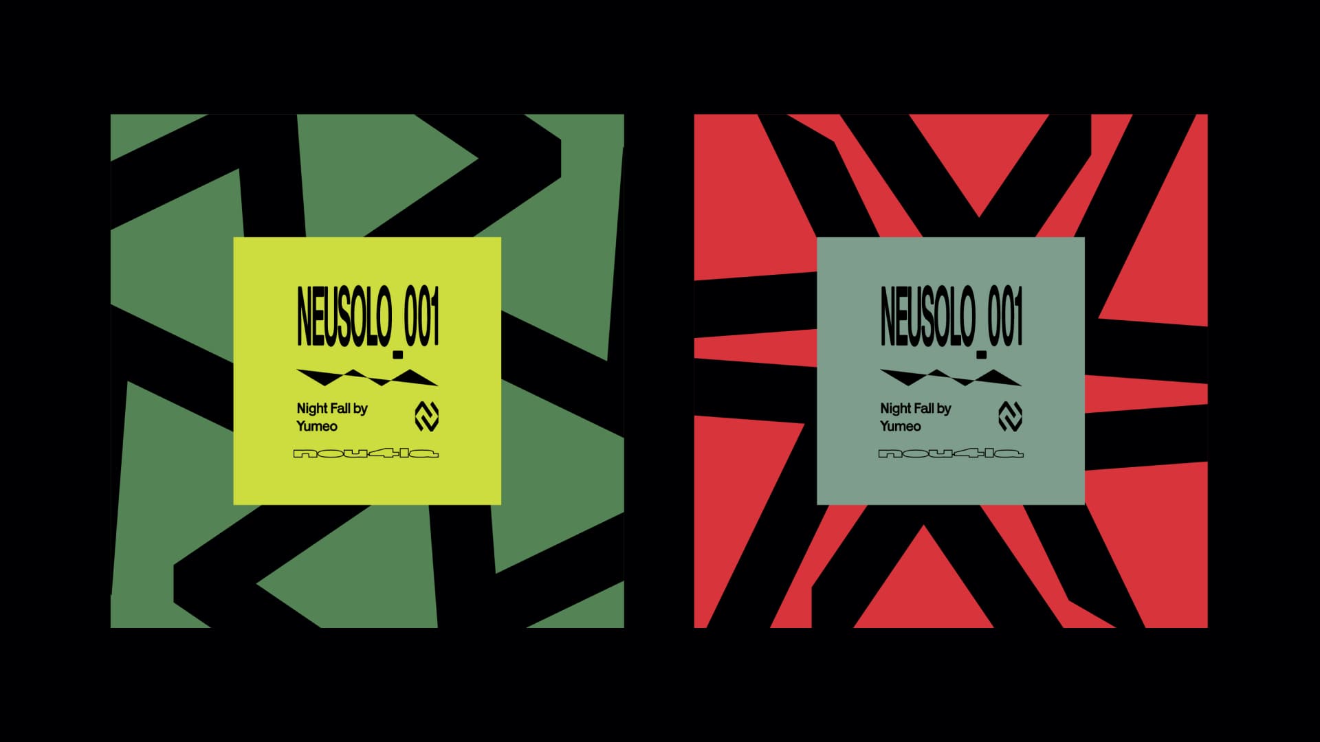
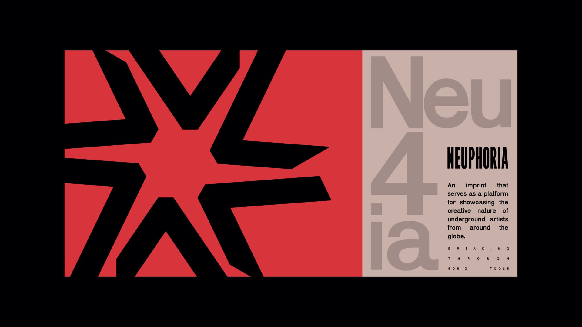
The identity translates this ethos through a monogram centered on the letter “N,” constructed from two distinct yet interlocking forms. This interaction becomes a visual metaphor for connection—between artist and audience, sound and space, individuality and collective expression. The angled structure introduces a sense of momentum, allowing the mark to feel alive, almost in flux, echoing the unpredictability of experimental techno. Through the use of negative space, the “N” reveals itself subtly, reinforcing the idea of depth and discovery, an identity that doesn’t demand attention outright, but unfolds over time, much like the music it represents.
Neuphoria emerges as an imprint rooted in the underground, an evolving platform built to amplify experimental techno and the voices shaping it. Based in Prague, and curated by crydotnn and wav909, the label positions itself within a global network of artists and listeners who thrive on sonic exploration. The brief called for an identity that could hold this raw, exploratory spirit while remaining precise and adaptable across formats. At its core, the brand needed to feel open yet intentional, resonating with a community that values discovery, collaboration, and the culture surrounding underground music. The challenge was to create a visual system that doesn’t just represent sound, but behaves like its fluid, immersive, and constantly evolving.
The identity translates this ethos through a monogram centered on the letter “N,” constructed from two distinct yet interlocking forms. This interaction becomes a visual metaphor for connection—between artist and audience, sound and space, individuality and collective expression. The angled structure introduces a sense of momentum, allowing the mark to feel alive, almost in flux, echoing the unpredictability of experimental techno. Through the use of negative space, the “N” reveals itself subtly, reinforcing the idea of depth and discovery, an identity that doesn’t demand attention outright, but unfolds over time, much like the music it represents.
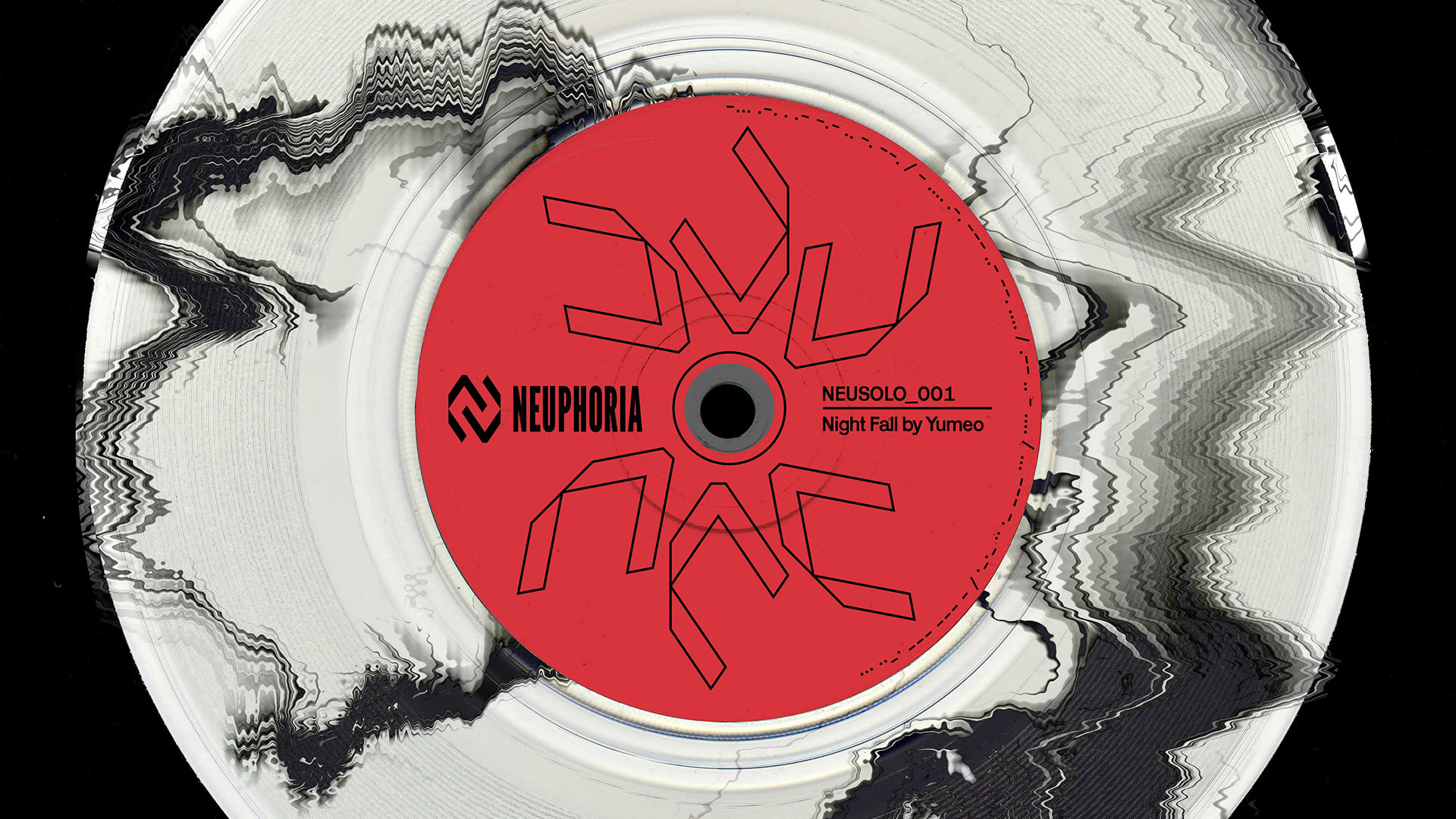
Neuphoria is an underground imprint built to amplify experimental techno and the voices shaping it. Based in Prague and curated by crydotnn and wav909, it exists within a global network of artists and listeners driven by sonic exploration. The identity was designed to hold this raw, exploratory spirit while remaining precise and adaptable—something that doesn’t just represent sound, but behaves like it: fluid, immersive, and constantly evolving.
At its core is a monogram built around the letter “N,” formed through two interlocking shapes. This interplay becomes a metaphor for connection—between artist and audience, sound and space. The angled structure introduces a sense of movement, while the use of negative space allows the “N” to emerge subtly, reflecting depth and discovery. The result is an identity that reveals itself over time, much like the music it represents.


THANK YOU FOR WATCHING
SELECTED WORKS
OBSMUS-VOL-2Album Art
Abel FerraraEditorial Design
ReMnAnTsLettering Design

Abstract ScienceBrand Identity Design
NodesType Design
KnowAlbum Art
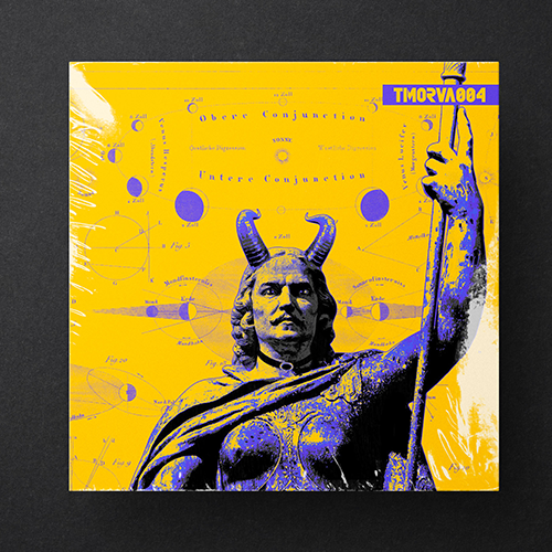
TMORVA004Album Art
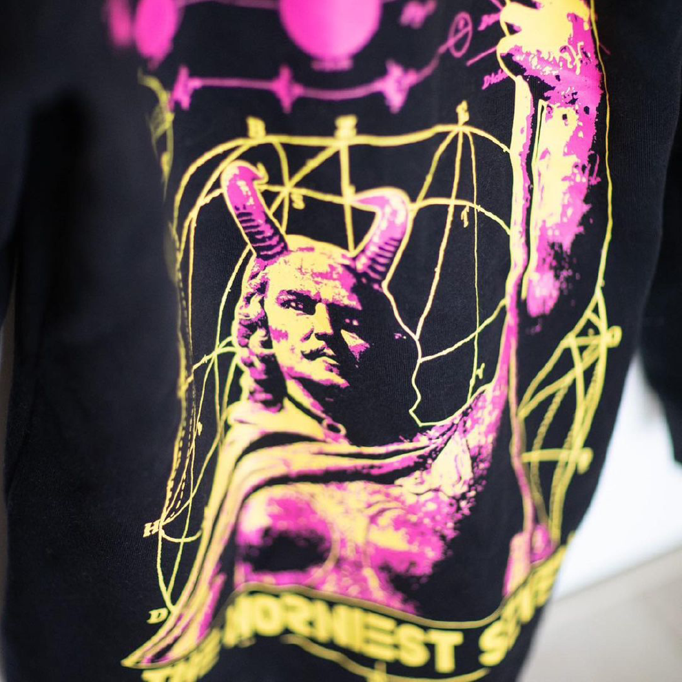
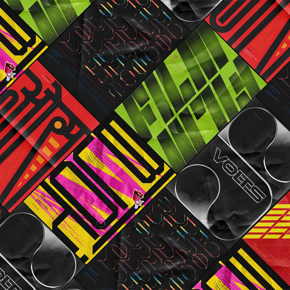
The Horniest SevenMerchandise, Apparel Design
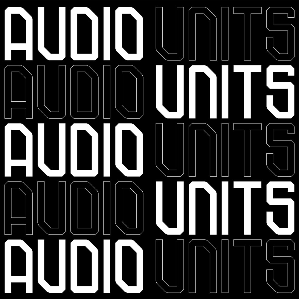
Audio UnitsBrand Identity design
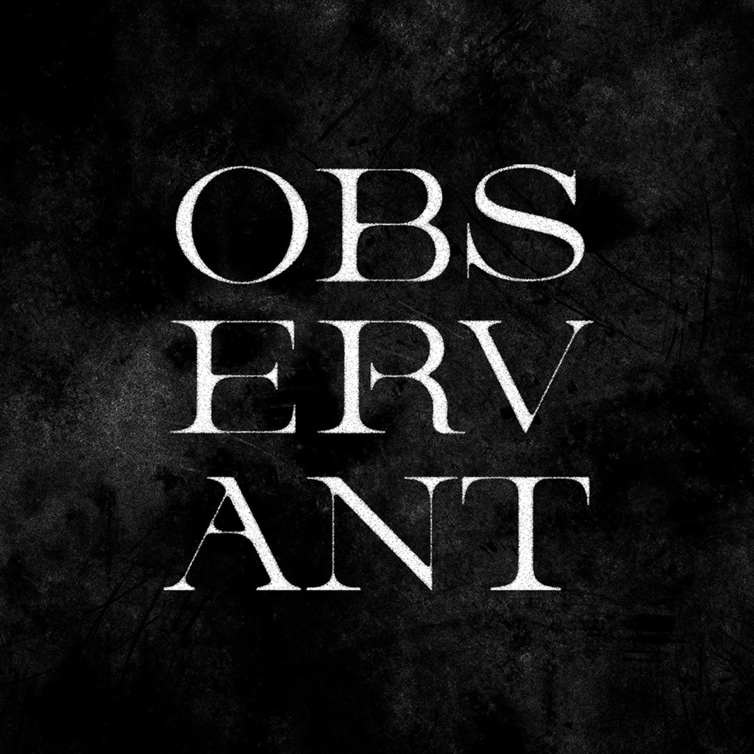
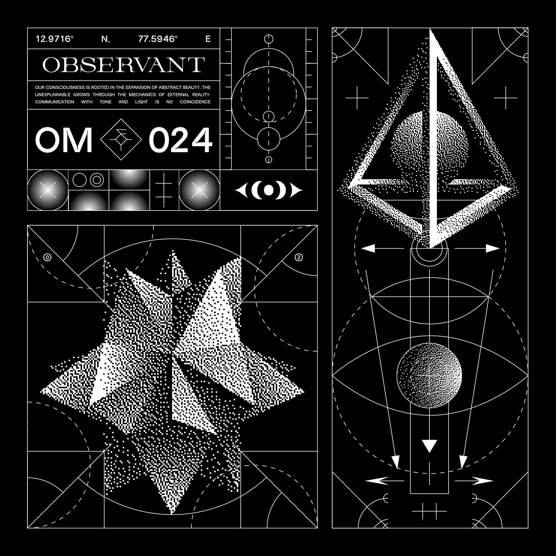
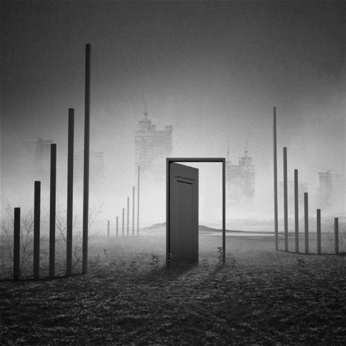
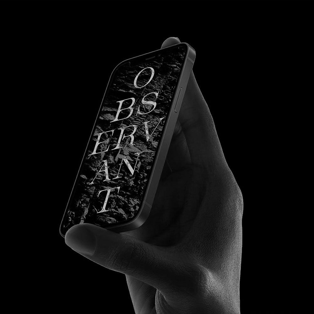
ObservantBrand Identity design
OM.WM_001Lettering Design
Lettering X TypographyLettering Design
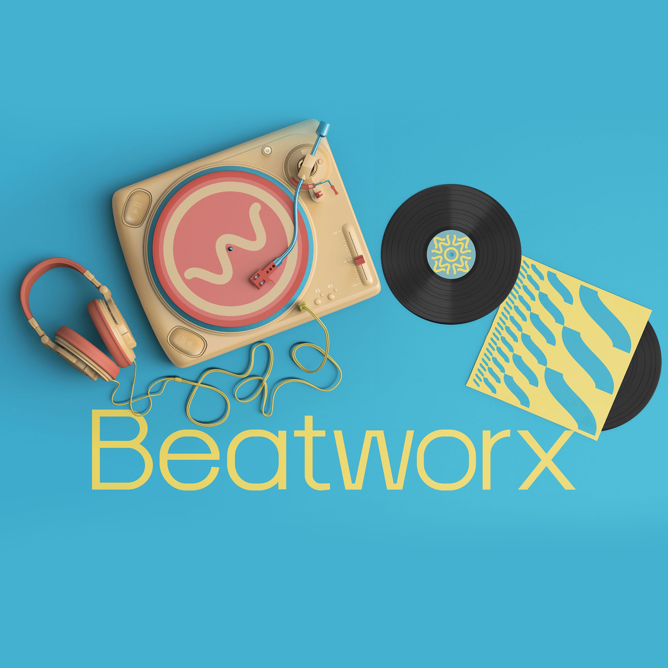
BeatworxBrand identity design
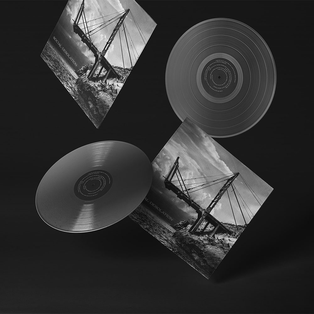
Social DesolationAlbum Art
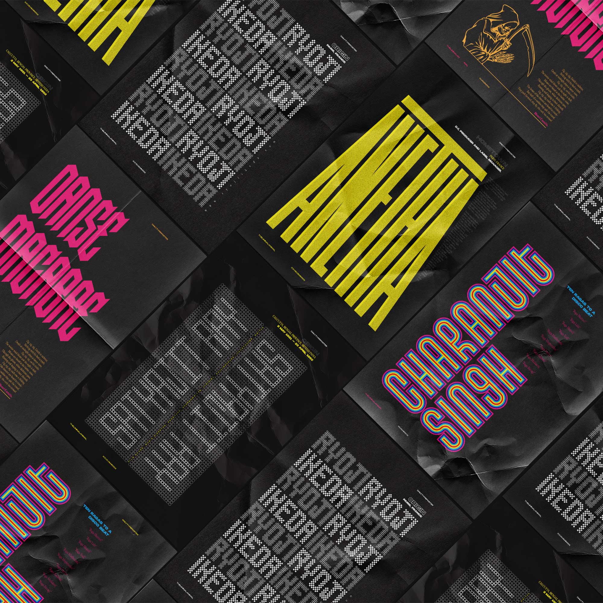
Indian ElectronicaLettering Design
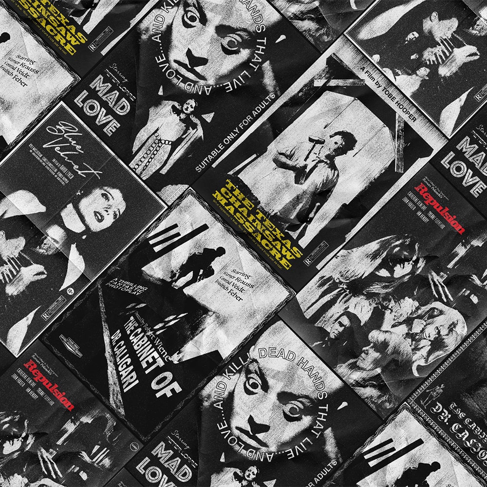
Cinema Poster Art 2Poster Design
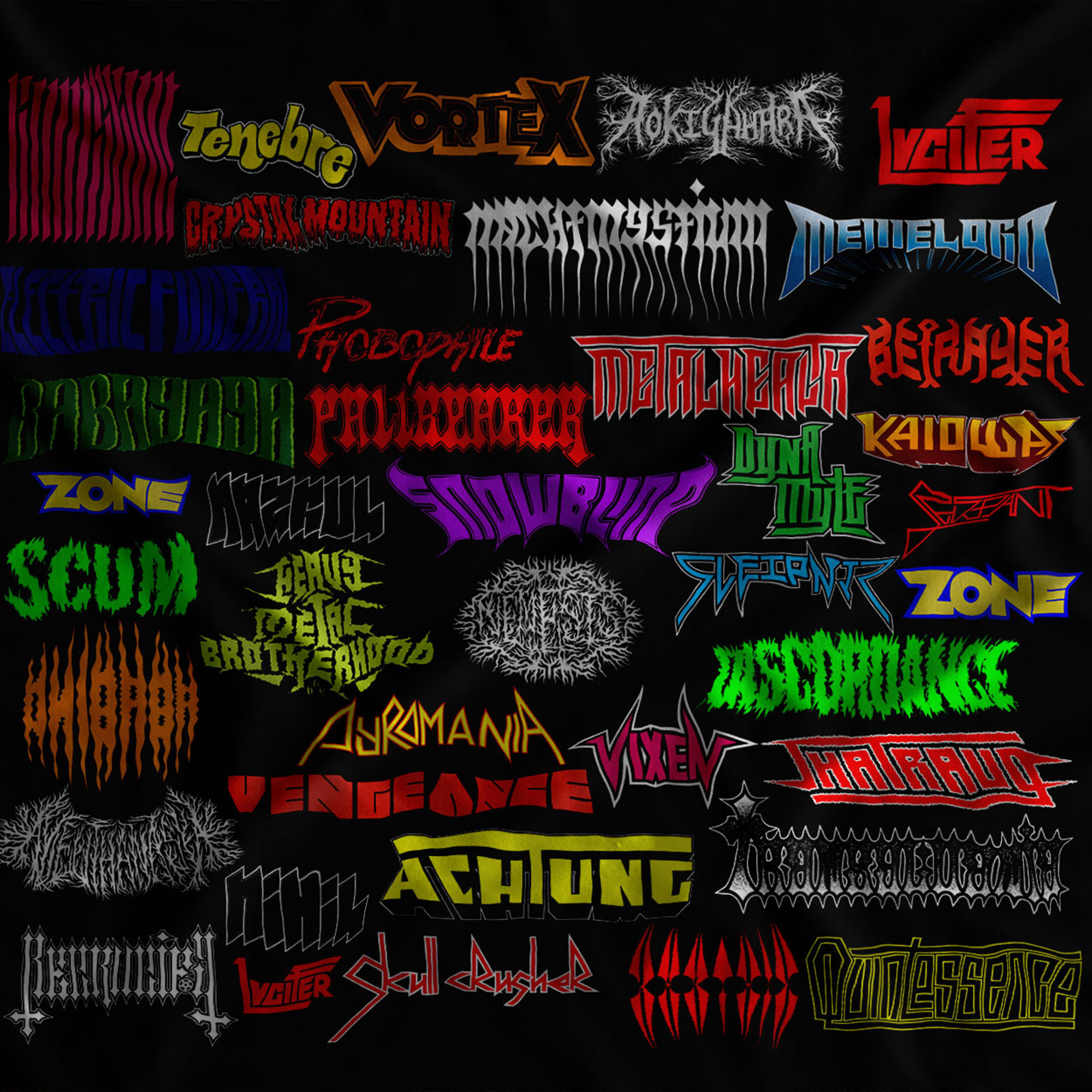
66 Days of MetalLettering Design
Tribute to OZUIllustration
ObservantAlbum Art